Harmony
This is a water reflection of a building and trees, and the harmony is in calm water of a lake. The image of a house and trees is very clear and you can see almost every leaf on branches in the reflection.
Movement
As you can see it's a photo of a small fountain near the swimming pool. I like the small splash of water which you can see in the middle of a photo, it's very dynamic and charming at the same time. This photo has a good contrast of movement and stability which you can see in walls of fountain and water.

Variety
This photo represents variety of different textures, colors and shapes. The colorful and soft carpet, classic neutral color and texture of a wall, and a sharp dark plinth.
Proportion
Here you can see a change of proportion between the flagpole and my (Janelle's) arm. Both of these elements take up a good portion of the photo and plays with the idea that the flagpole is smaller than it really is.
Rhythm
The rhythm in this picture can be seen with the repetition of the windows going down is size as they get further away. This makes our eyes travel down the hallway.
Unity
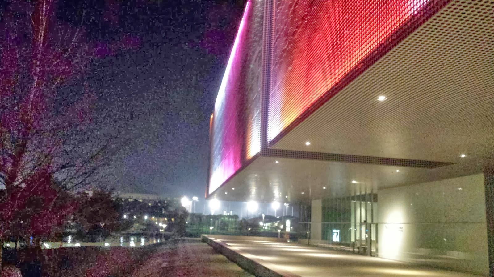
This image represents unity between various elements including color, line, shape, proportion, and rhythm.
The straight lines of the Tampa Art Museum carry your eye across the photo, the colors of the museum make the building pop out in the photo and even takes part in the proportion of the photo. The museum takes up a large part of the photo and we can tell it is apart of the foreground due to the clarity of the museum as opposed to the foggy background. There is repetition of circles among the building adding different shapes to the image and making the appearance of the museum more visually interesting on a whole.
Space: There is a lot of empty space within this image that really catches the eye. All the arches and empty spaces between the designs really contrast with the light coming in from behind it.
Texture: It is illistrated in this photo through the bark of the palm tree. There is much roughness and sporatic growths that constants the sharp green leaves behind it, or the smooth white pillar in the background.
Balance: Balance is demonstrated through the seemingly similar sides of the hallway that causes one to look down to the end. At the end there is a curve which catches the audiences attention and keeps the image from being flat.
Color: pink is the main focus of the image. The pink flower blends in with the hair and makes it the focal point. I see mostly secondary colors and cool colors . There are a few line patterns in the image as well.
Emphasis: As you can see the point of focus in the image is the tree, because it is in the middle and in front of the image. The pattern of the building in the background stands out as well. The shadows from the tree reflect off from the building.
Line: The lines in the picture are horizontal and vertical as well. The bricks have a specific pattern followed throughout the whole image. The movement is distributed equally in and is not going in a distinct direction.
Shape: You can see a combination of rectangles and squares throughout the whole image. There are few oval shapes and diamond like figures. The image has a lot of depth and your eyes follow it all the way to the back of the image.


No comments:
Post a Comment